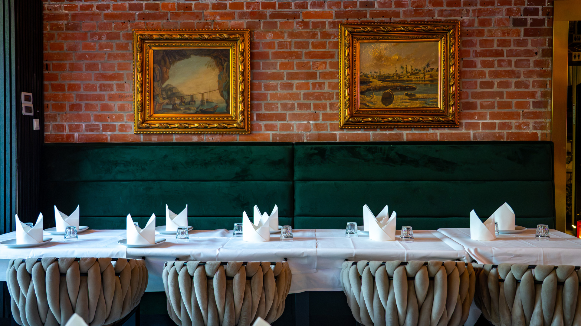
LeMont






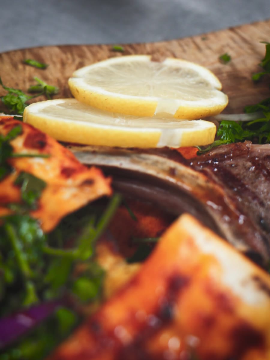
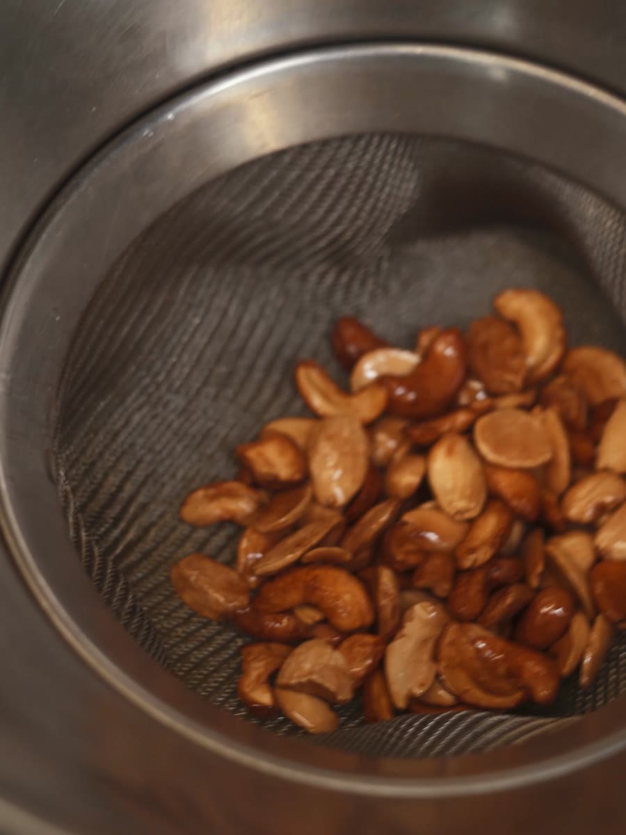
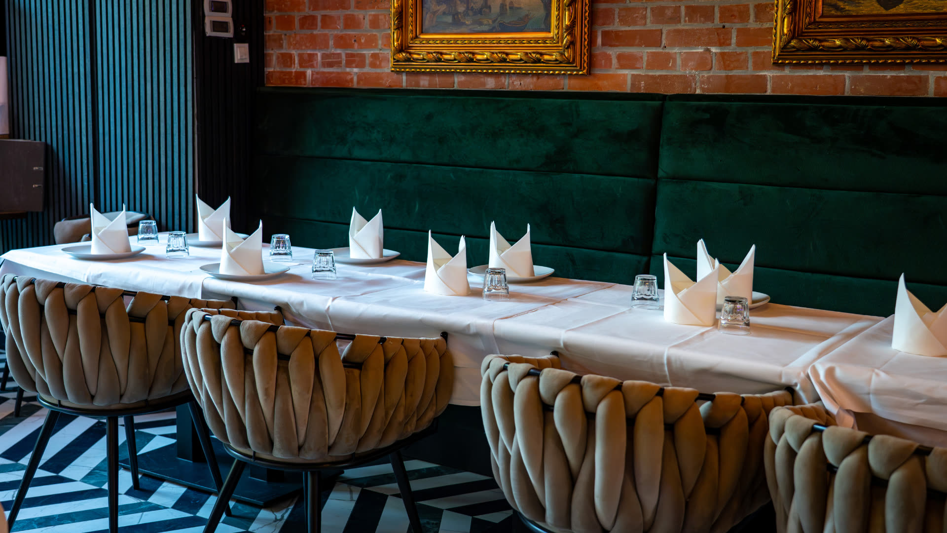
The food already had a story.
The brand didn't tell it yet.
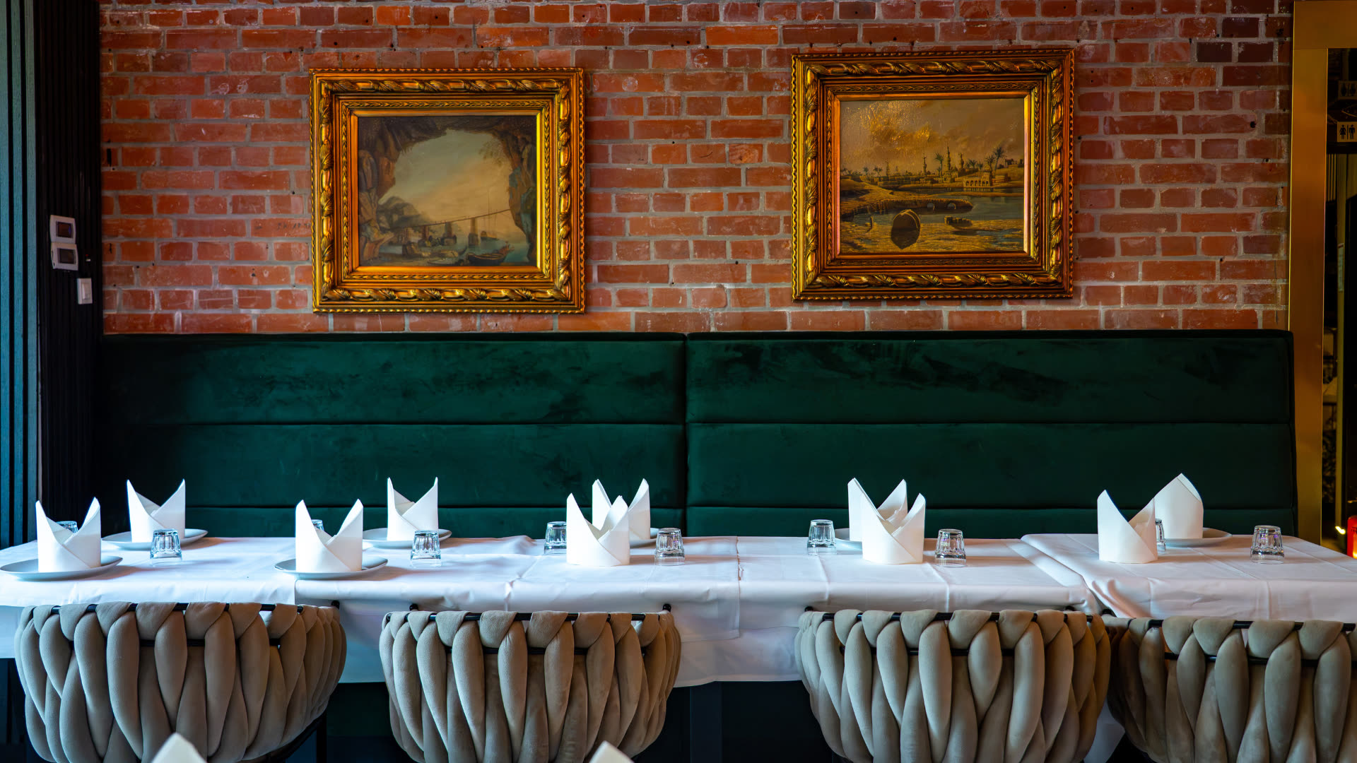
The same restaurant, twelve months apart
One of these was designed.
The other was posted.
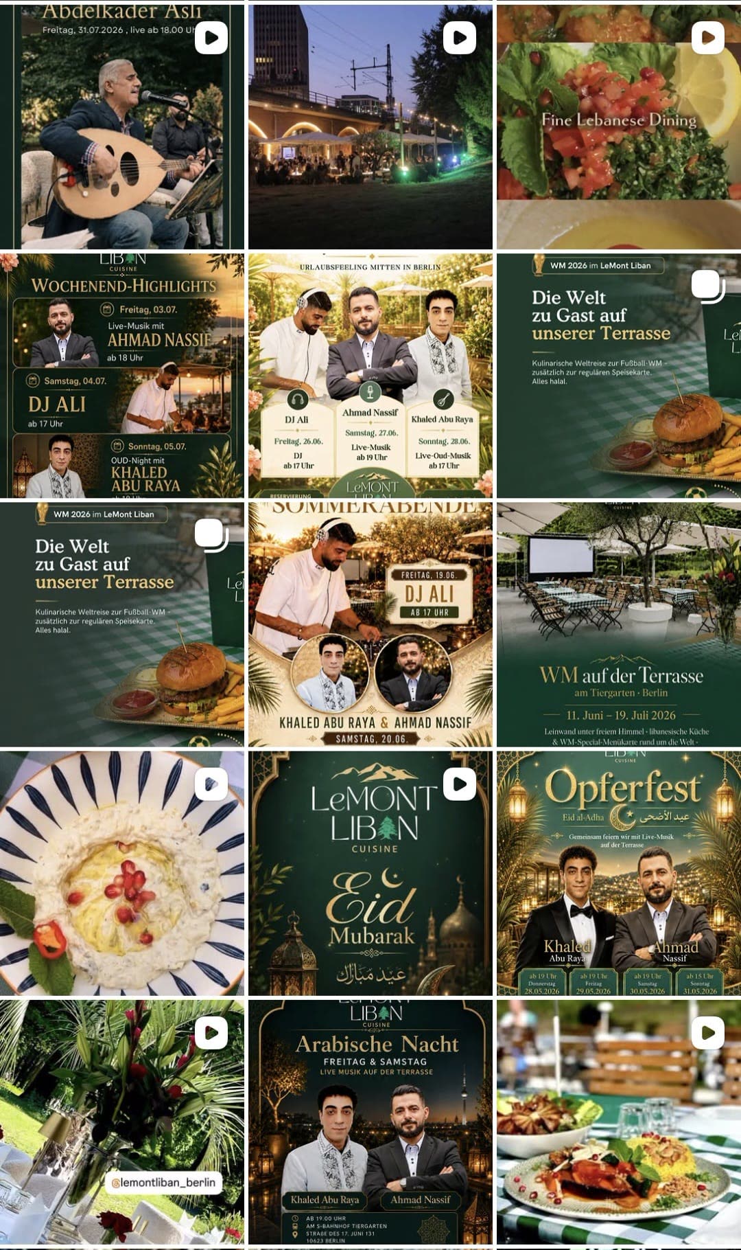
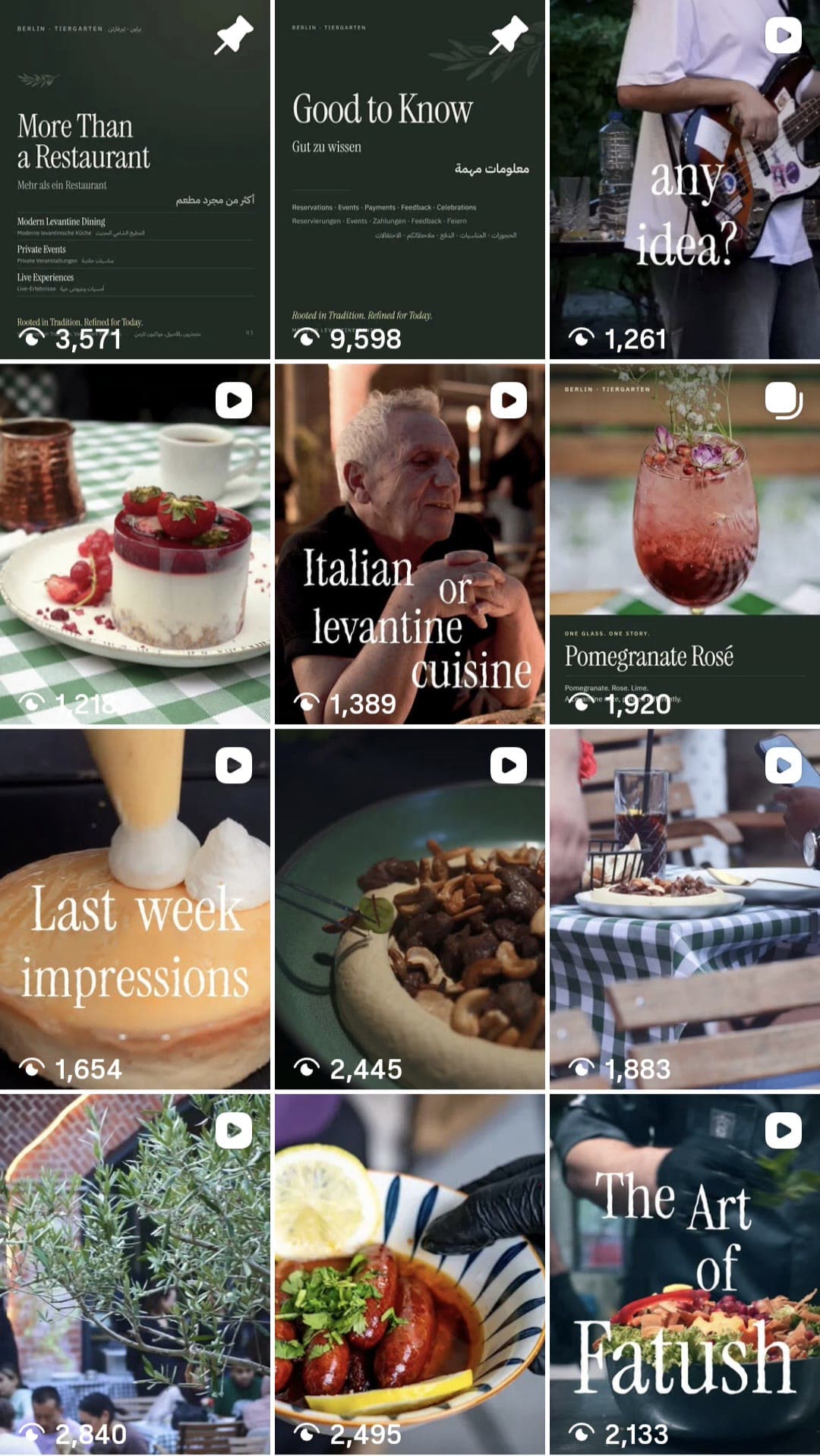
Gold borders.
A different visual language every week.
One creative system.
Every touchpoint recognisably LeMont.
IBM Plex Sans carries the facts.
The distance between them is the brand.



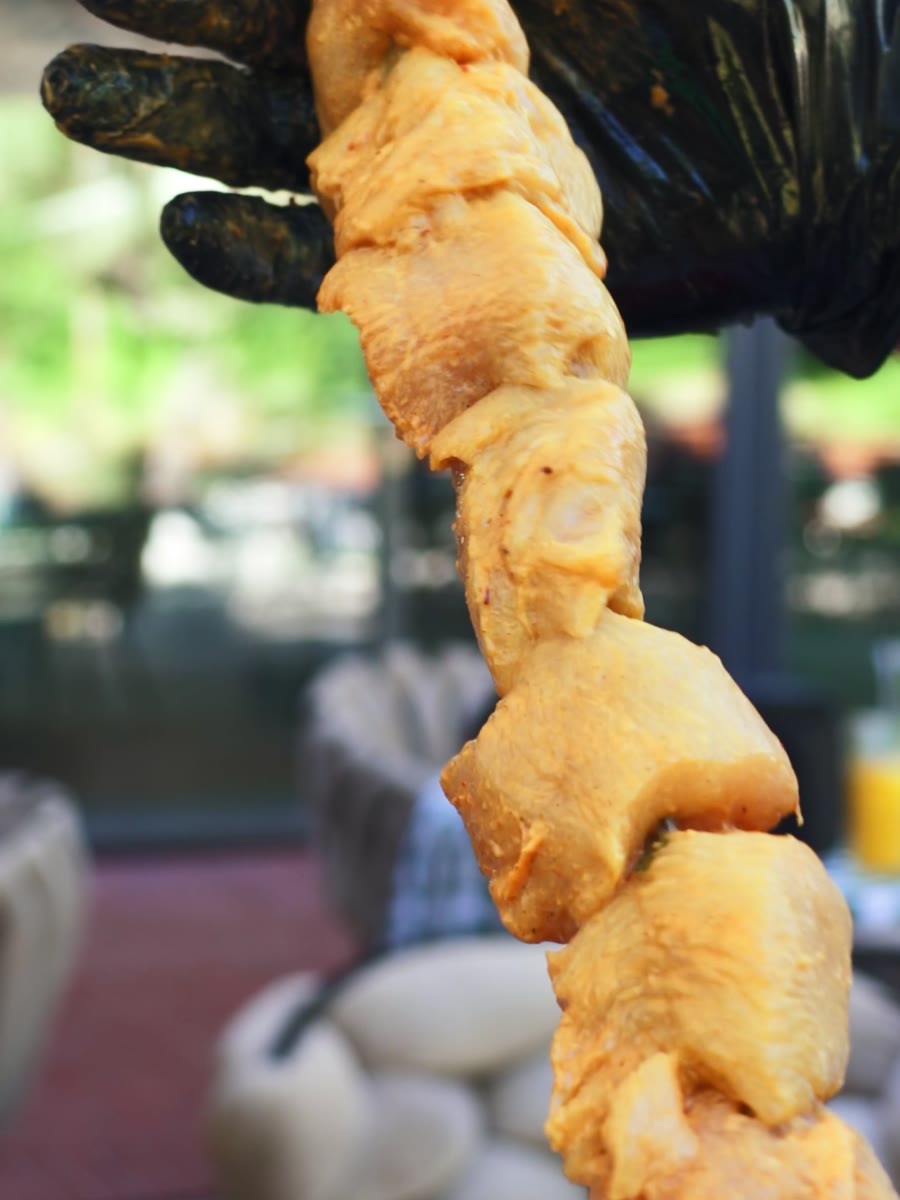
Photographed the way it is actually eaten
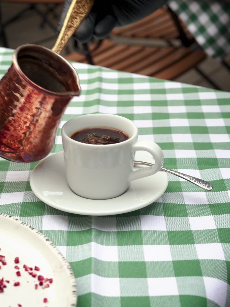
What if you could taste the identity?
A signature drink designed to taste as considered as the visual identity feels.
Content that feels like the place.
The grade
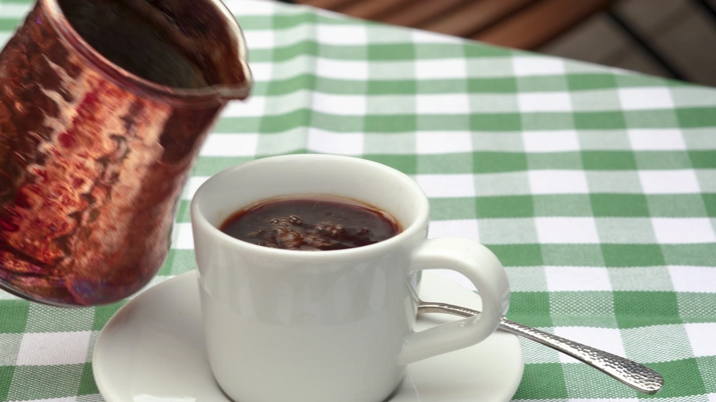
Three grades. One felt like the room.



FemiCora





Your pelvic floor is already part of your life.
Almost nobody was taught it.
DM Sans carries the facts.
Butter for what matters. Baby blue for what reassures.
One subject, split into four things a woman can ask for.
Pain & intimate health
Discomfort, tension and intimacy — communicated clearly and without embarrassment.
Bladder & bowel support
Urgency, leakage, habits and the relationship between everyday behaviour and pelvic-floor function.
Pregnancy & postpartum
Clear education around the changes that can happen during pregnancy and after birth.
Movement & prevention
Breathing, pressure, movement and training — building understanding before symptoms become the starting point.
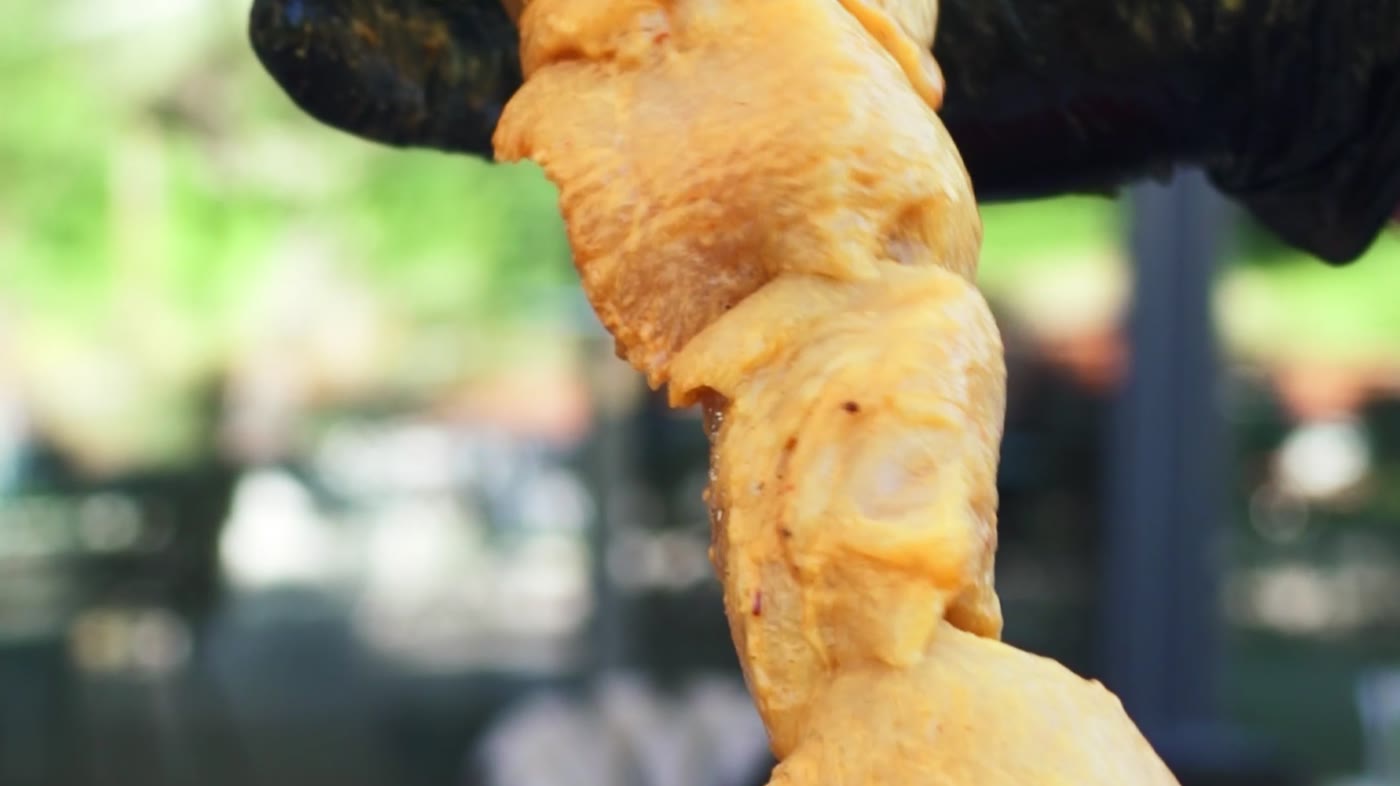
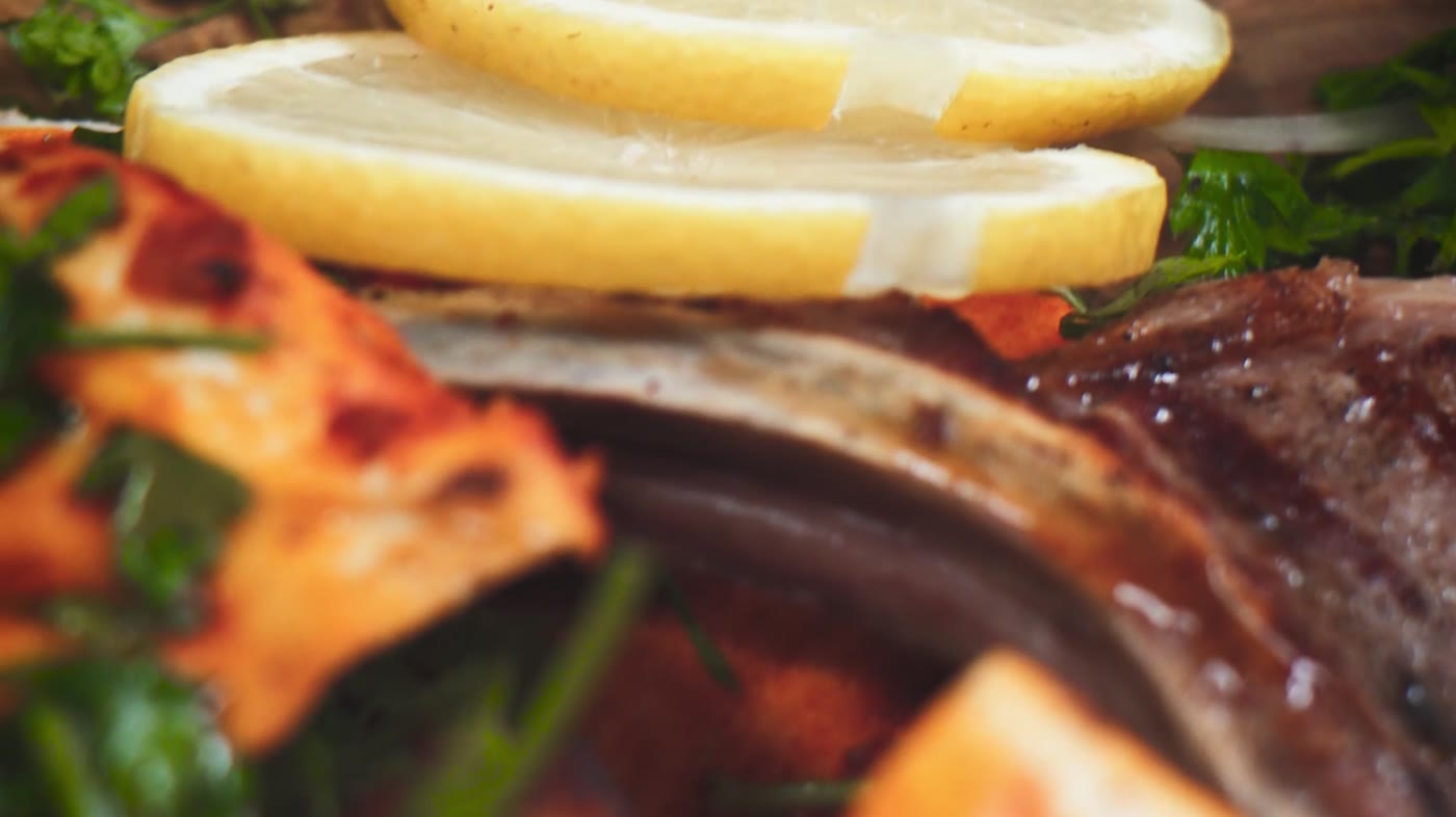
Photographed like real life, not like a clinic
Learn in the way that works for you.
1:1 online guidance
Private sessions, anywhere. Your questions, your body, your pace.
Private · onlineBerlin workshops
Small groups, in person. Learning together makes the subject ordinary.
Groups · in personEducation & prevention
Structured, evidence-informed material for the questions that come before symptoms.
Self-paced · evidence-informedWomen’s health physiotherapist
FemiCora was created to make knowledge around pelvic health more understandable and approachable — not only when someone is already experiencing symptoms, but as part of broader education and prevention.
PocketBuxx
PocketBuxx
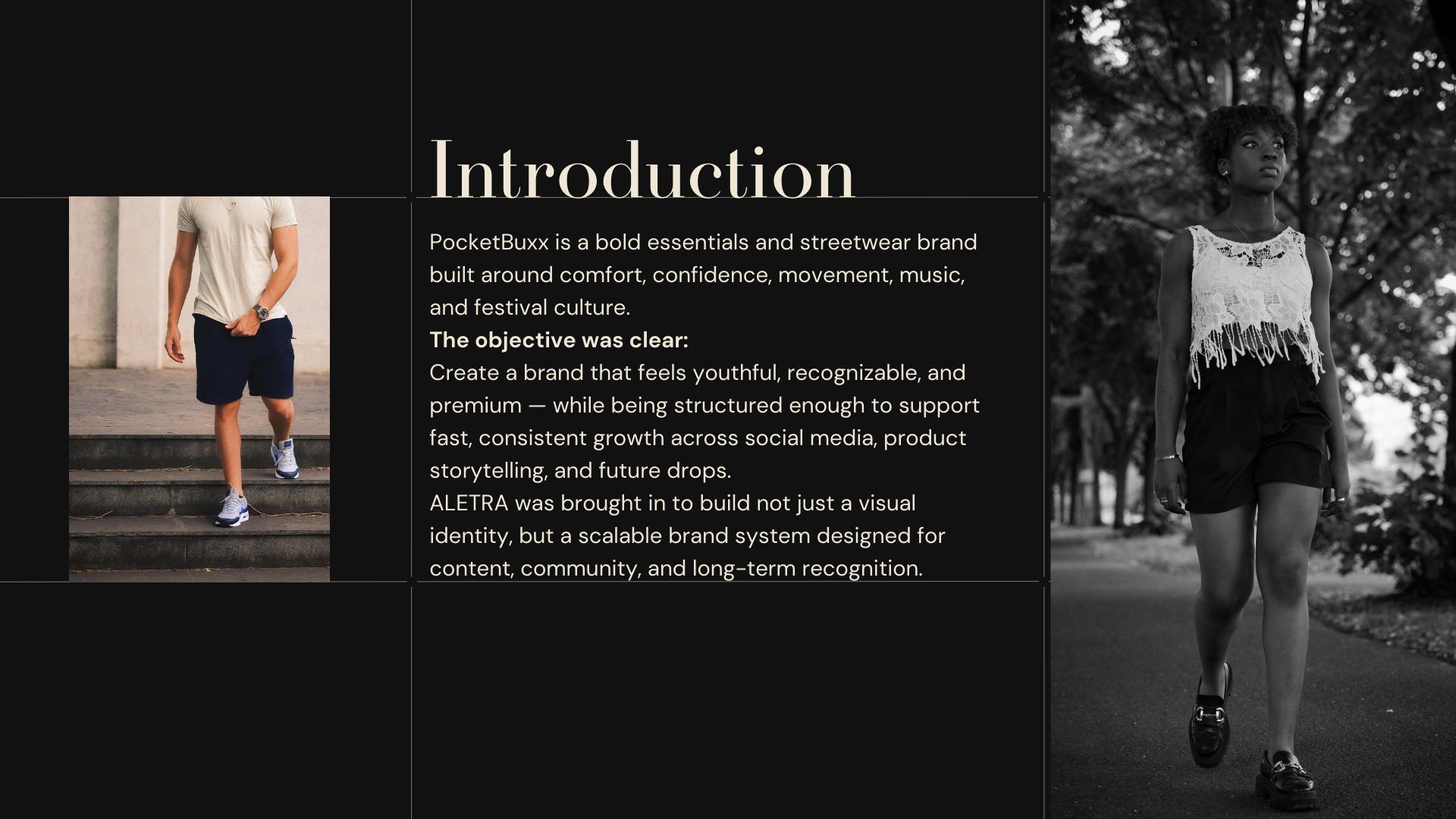
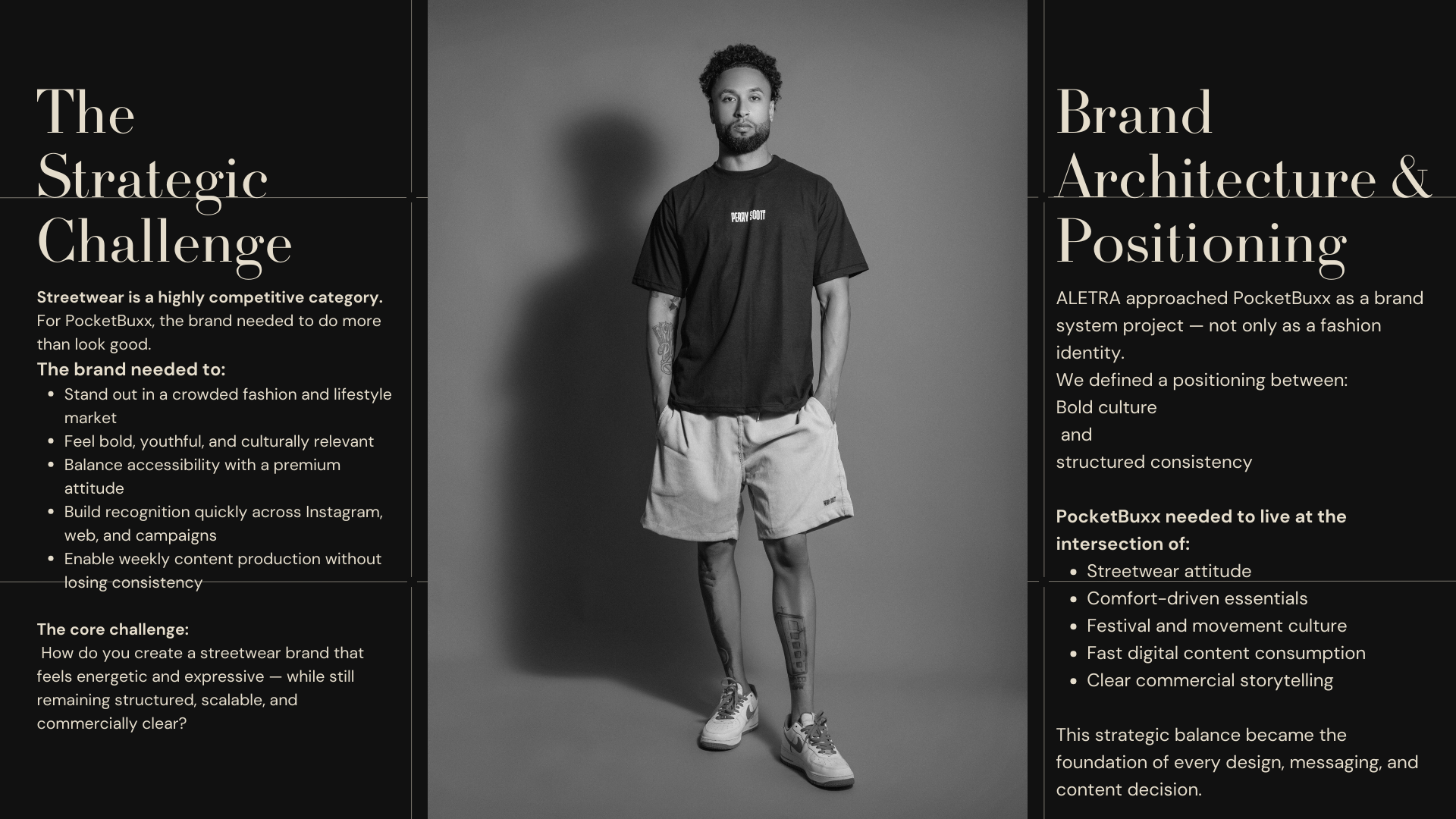
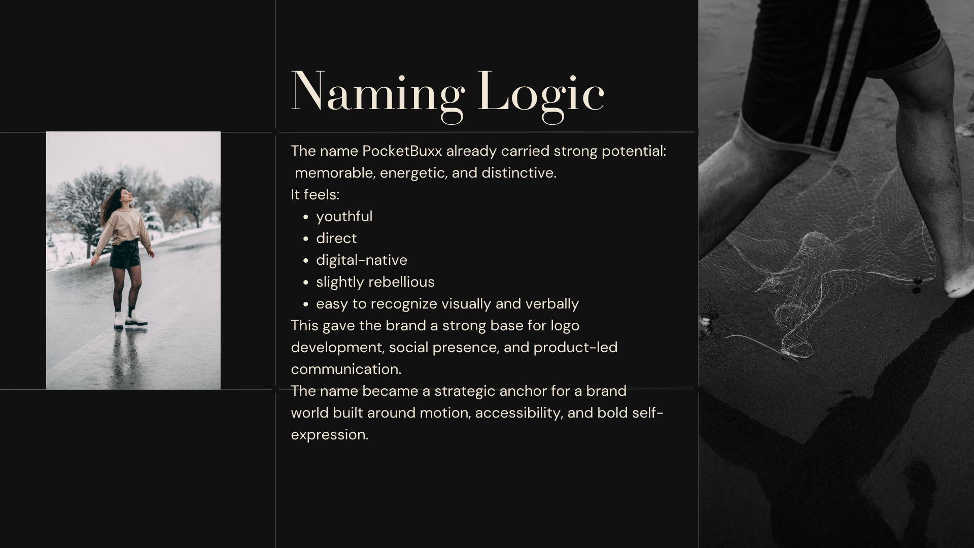
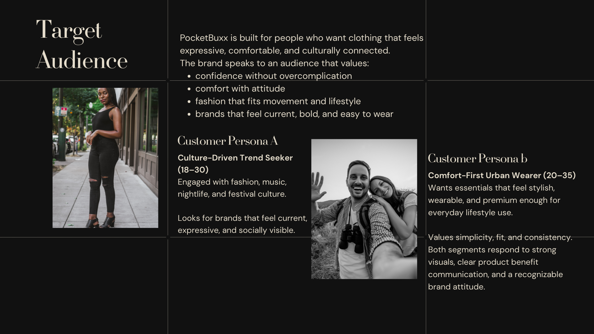
PocketBuxx is a streetwear and essentials brand designed for a culture-driven audience that values comfort, confidence, and visual attitude. The project focused on building a brand world that feels youthful, bold, and instantly recognizable — while remaining structured enough to support regular content production and future brand growth.
ALETRA approached the project as both a branding and content systems task: creating not only a stronger visual identity, but also a repeatable framework for storytelling, launches, and social communication.
Role and scope
- Brand identity and visual system
- Creative direction for social content
- Content templates and recurring formats
- Product storytelling framework
Challenge
PocketBuxx needed to stand out in a crowded apparel market with a look that feels youthful, premium, and immediately recognizable.
At the same time, the brand needed enough structure to produce content consistently across products, launches, and social media without losing clarity or quality.
Approach
ALETRA built the brand around three strategic priorities:
- Distinct brand recognition — bold visual cues, clear tone, and strong stylistic consistency
- Scalable content production — repeatable templates and structured formats for weekly output
- Conversion-first storytelling — product messaging focused on comfort, quality, and lifestyle relevance communicated quickly and clearly
Deliverables
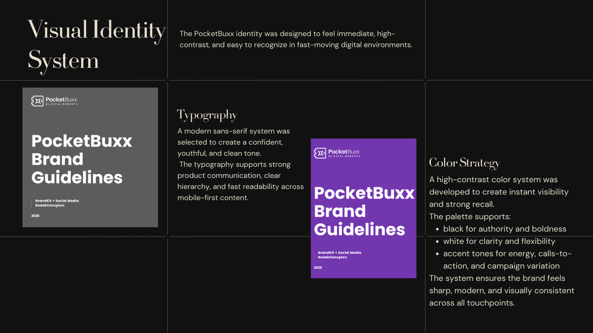
- Brand identity rules and visual system
- Typography, color, and layout guidance
- Social templates for promos, announcements, drops, and product highlights
- Creative direction for recurring post and reel formats
- Product storytelling structure for launches and campaign content
- Consistency guide for future campaigns and collaborations
Visual language
- Color — a high-contrast visual base with bold accents to create fast recognition and stronger calls to action
- Type — modern sans-serif typography with a confident, youthful tone
- Layout — punchy hierarchy, product-first composition, and bold spacing designed for digital attention
- Style — clear, energetic, and built for scroll-stopping communication across web and social
Outcome
PocketBuxx now has a stronger and more coherent brand presence built for consistency, visibility, and scale.
The project delivered:
- a clearer visual identity with stronger recognition across touchpoints
- repeatable content formats for weekly posting and product communication
- a more structured system for launches, drops, and collaborations
- a scalable brand foundation that connects design, storytelling, and growth