LeMont





The food already had a story.
The brand didn't tell it yet.
The same restaurant, twelve months apart
One of these was designed.
The other was posted.

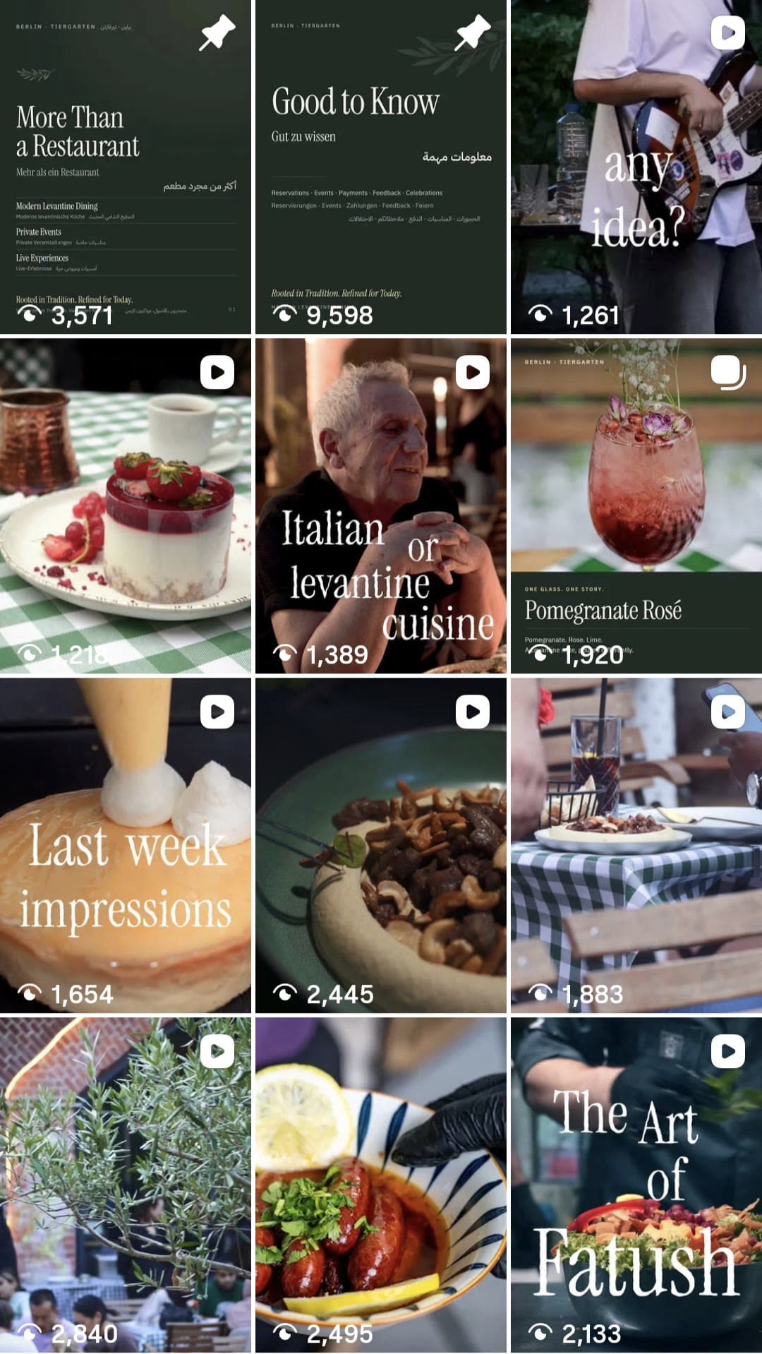
Gold borders.
A different visual language every week.
One creative system.
Every touchpoint recognisably LeMont.
IBM Plex Sans carries the facts.
The distance between them is the brand.



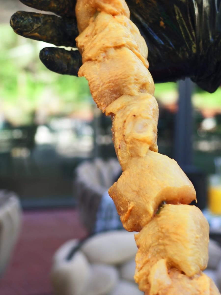
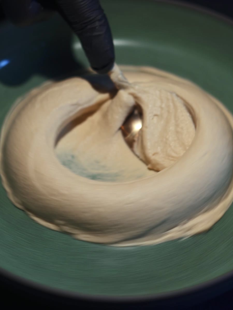
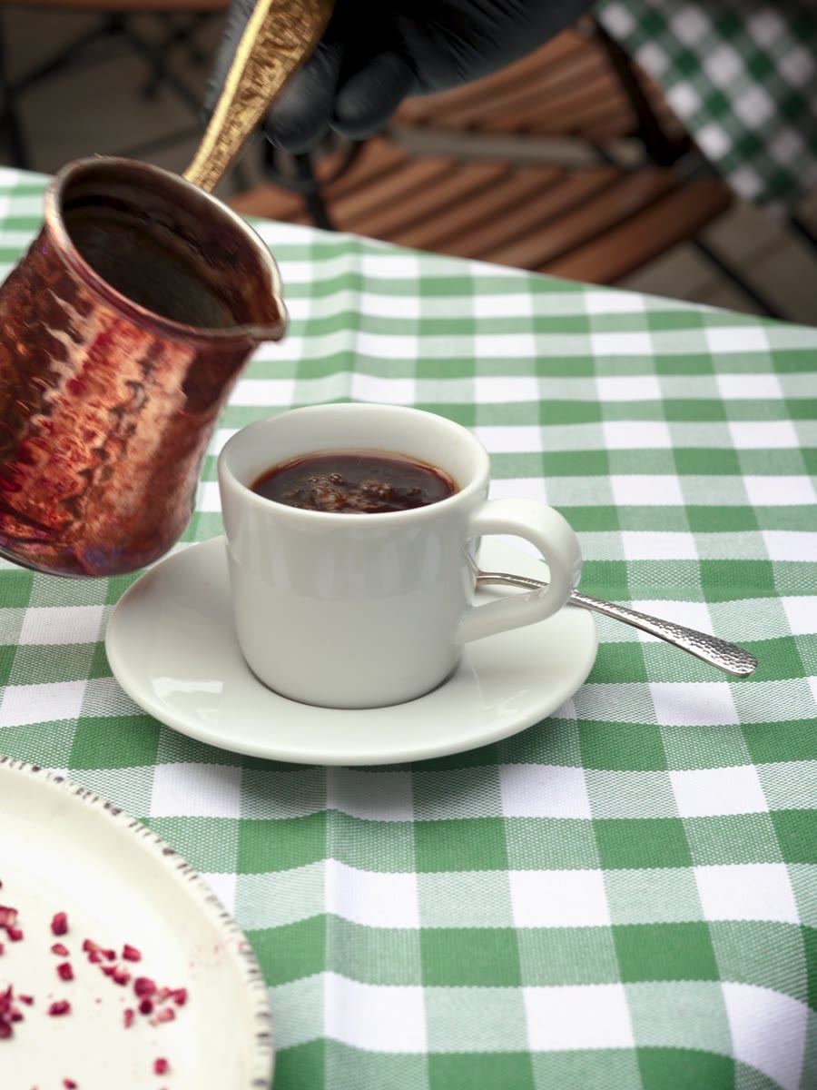
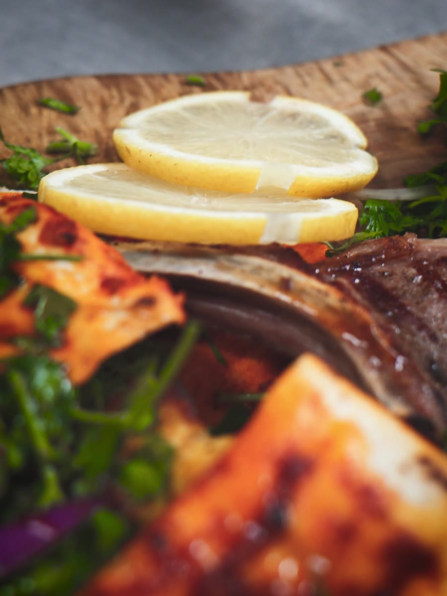
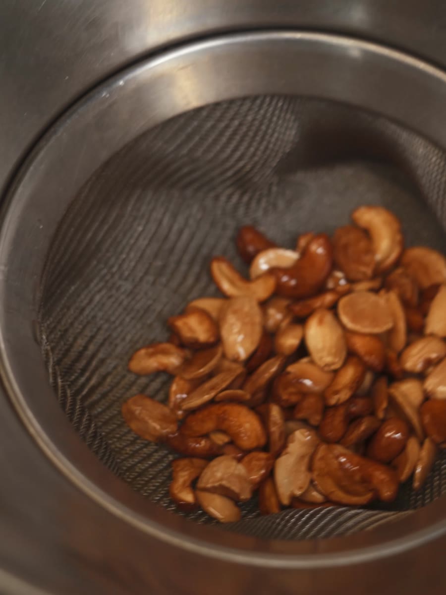
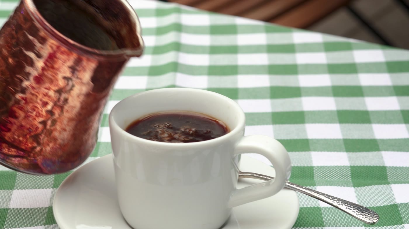
Photographed the way it is actually eaten
What if you could taste the identity?
A signature drink designed to taste as considered as the visual identity feels.
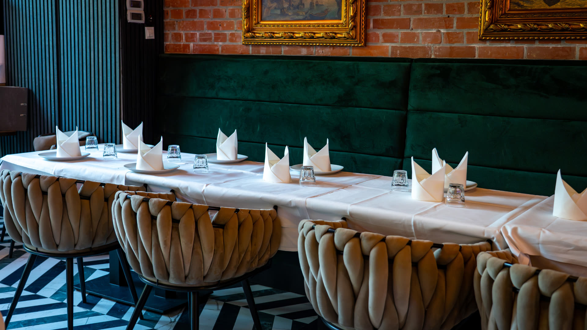
Content that feels like the place.
The grade
Three grades. One felt like the room.




FemiCora




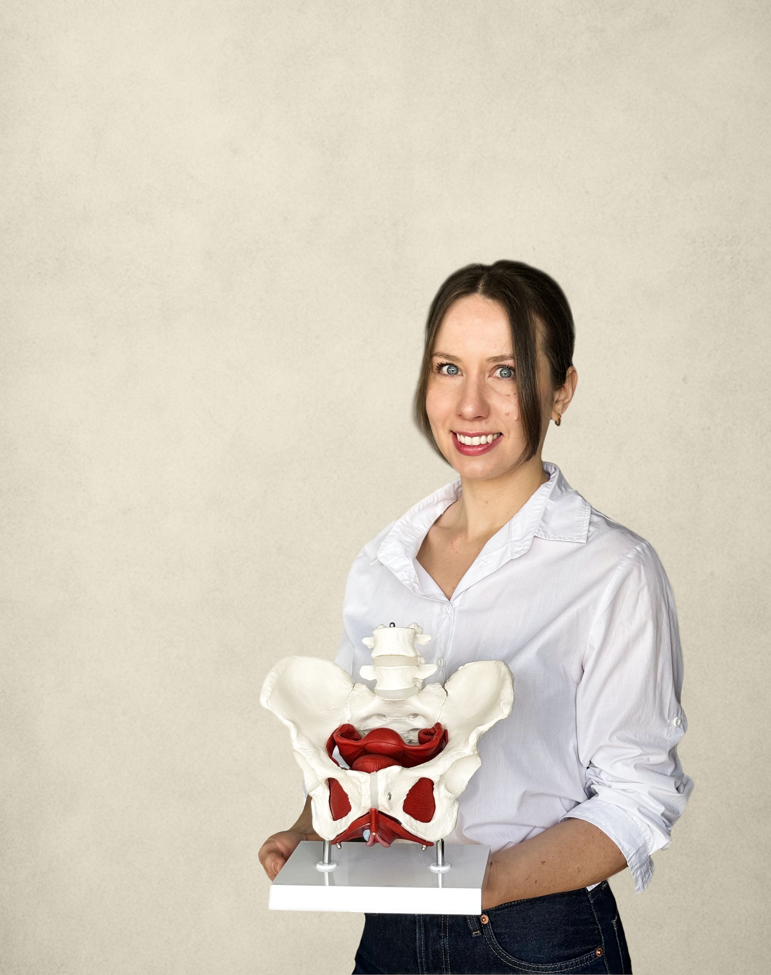
Your pelvic floor is already part of your life.
Almost nobody was taught it.
DM Sans carries the facts.
Butter for what matters. Baby blue for what reassures.
One subject, split into four things a woman can ask for.
Pain & intimate health
Discomfort, tension and intimacy — communicated clearly and without embarrassment.
Bladder & bowel support
Urgency, leakage, habits and the relationship between everyday behaviour and pelvic-floor function.
Pregnancy & postpartum
Clear education around the changes that can happen during pregnancy and after birth.
Movement & prevention
Breathing, pressure, movement and training — building understanding before symptoms become the starting point.
Photographed like real life, not like a clinic
Learn in the way that works for you.
1:1 online guidance
Private sessions, anywhere. Your questions, your body, your pace.
Private · onlineBerlin workshops
Small groups, in person. Learning together makes the subject ordinary.
Groups · in personEducation & prevention
Structured, evidence-informed material for the questions that come before symptoms.
Self-paced · evidence-informedWomen’s health physiotherapist
FemiCora was created to make knowledge around pelvic health more understandable and approachable — not only when someone is already experiencing symptoms, but as part of broader education and prevention.
LeMont
.png)