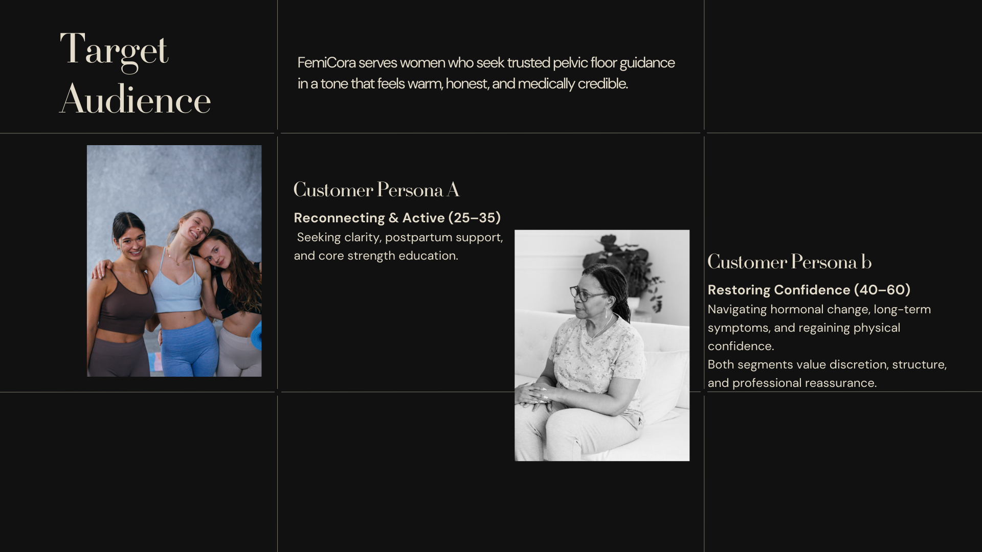
FemiCora
FemiCora Physio is a modern pelvic-floor education brand for women — created to make body knowledge feel accessible, respectful, and empowering. ALETRA developed a clear visual identity and content system that communicates trust and medical credibility without feeling cold or overly clinical.
Brand Identity
Brand Experience
100%
organic follower growth
zero paid ads, zero boosting
zero paid ads, zero boosting
8,000+
Instagram views
and growing
and growing
5+
5–6 workshop invitations recieved
First paid workshop confirmed for 2026
First paid workshop confirmed for 2026
100%
Design and agency costs saved
zero external spend since launch
zero external spend since launch
FemiCora Physio
FemiCora Physio is a women-focused education brand in the pelvic-floor space. The goal was to create a brand that feels trustworthy, modern, and supportive — making complex health topics easier to understand, easier to share, and more approachable in everyday digital communication.
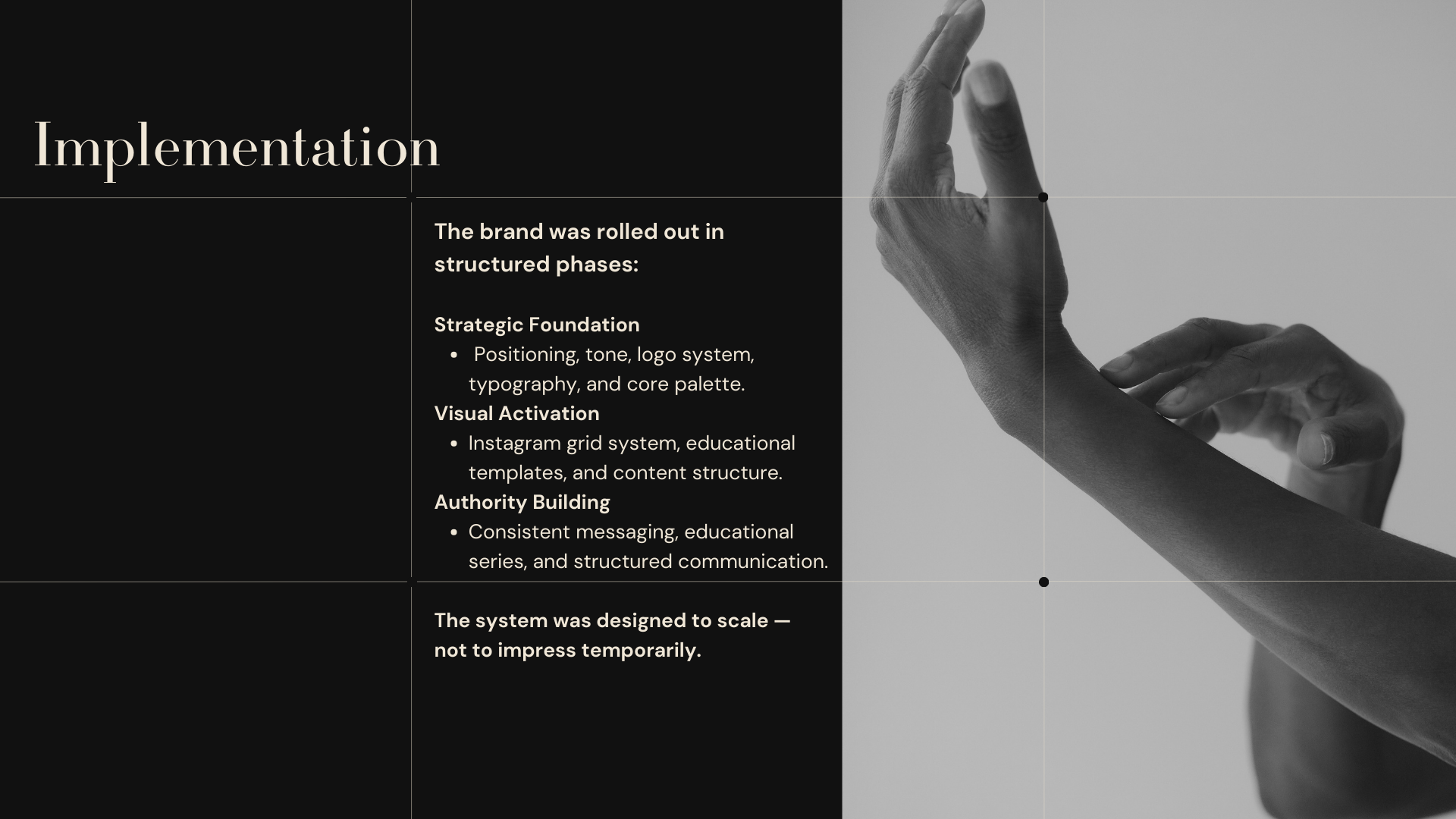
ALETRA built a visual identity and structured content framework designed to help the brand educate with clarity while maintaining warmth, credibility, and consistency across every touchpoint.
Role and scope
- Brand identity and visual direction
- Instagram-first content system
- Copy structure and template guidelines
Challenge
- Pelvic-floor topics are often communicated in one of two ineffective ways: either too clinically, which creates distance, or too vaguely, which reduces trust and clarity.
- FemiCora needed a brand that could balance both sides — medically credible, but still human, warm, and easy to engage with.
Approach
- ALETRA developed the brand around three core principles:
- Warm credibility — a visual language that feels professional and trustworthy without becoming sterile
- Education made simple — content formats that turn complex anatomy and health information into clear, accessible communication
- Consistency through system — reusable templates and clear rules that make content easier to produce and easier to recognize
Deliverables
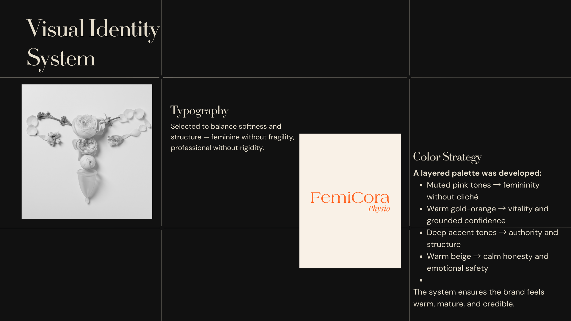
- Logo and icon direction with usage rules
- Color palette and typography system
- Post and carousel templates for education, anatomy, myths vs facts, and tips
- Reels covers and highlight cover system
- Layout, spacing, and readability guidelines
- Copy tone guide built around a supportive, direct, and respectful voice
Visual language
- Color — a warm and calming palette with beige and soft pink, supported by orange accents for emphasis and calls to action
- Type — clean, highly readable typography with a soft editorial edge for a premium but approachable feel
- Layout — generous spacing, simple grids, and strong hierarchy to support quick understanding
- Style — soft shapes and anatomy-led visuals that feel respectful, modern, and non-clinical
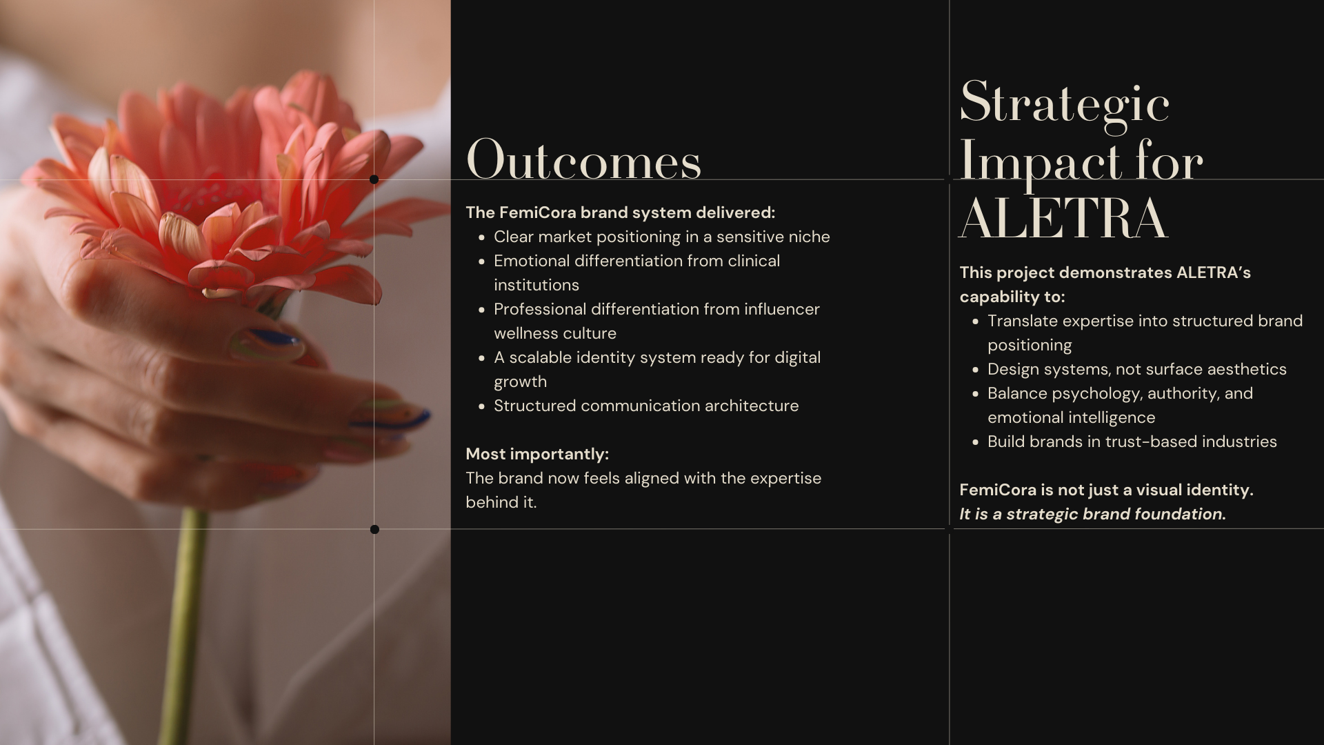
Outcome
- FemiCora now has a clear and recognizable brand foundation built for education, trust, and long-term consistency.The project delivered:
- a complete visual identity aligned with the founder’s tone and vision
- a structured content system for faster and more coherent execution
- reusable templates and prompts to support scalable content creation
- a practical social media structure for weekly communication
- early organic traction in the first weeks after launch
More Cases

Your story, grows with us
Let’s design a brand that feels like you
.png)