PocketBuxx
PocketBuxx
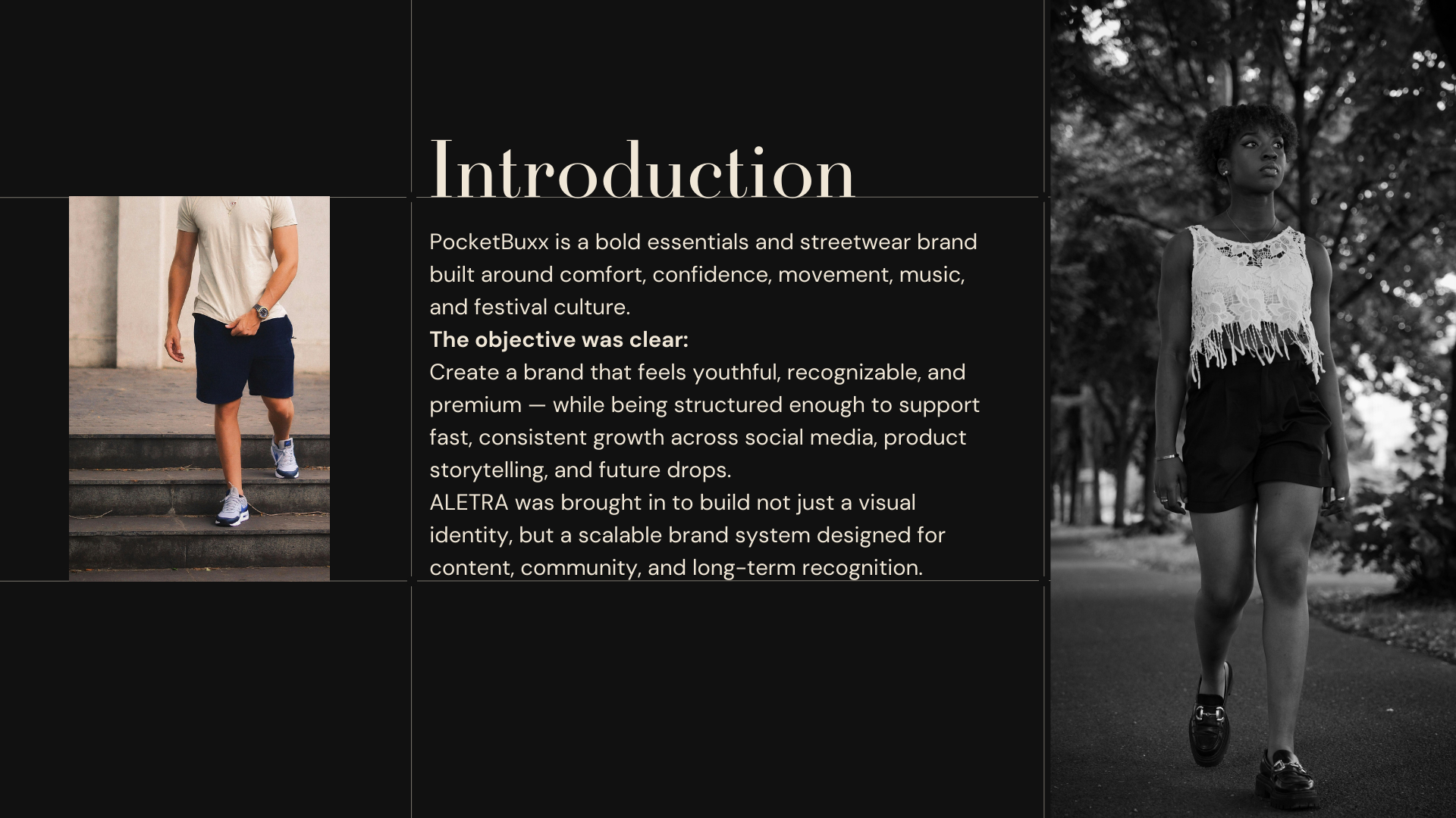
PocketBuxx is a streetwear and essentials brand designed for a culture-driven audience that values comfort, confidence, and visual attitude. The project focused on building a brand world that feels youthful, bold, and instantly recognizable — while remaining structured enough to support regular content production and future brand growth.
ALETRA approached the project as both a branding and content systems task: creating not only a stronger visual identity, but also a repeatable framework for storytelling, launches, and social communication.
Role and scope
- Brand identity and visual system
- Creative direction for social content
- Content templates and recurring formats
- Product storytelling framework
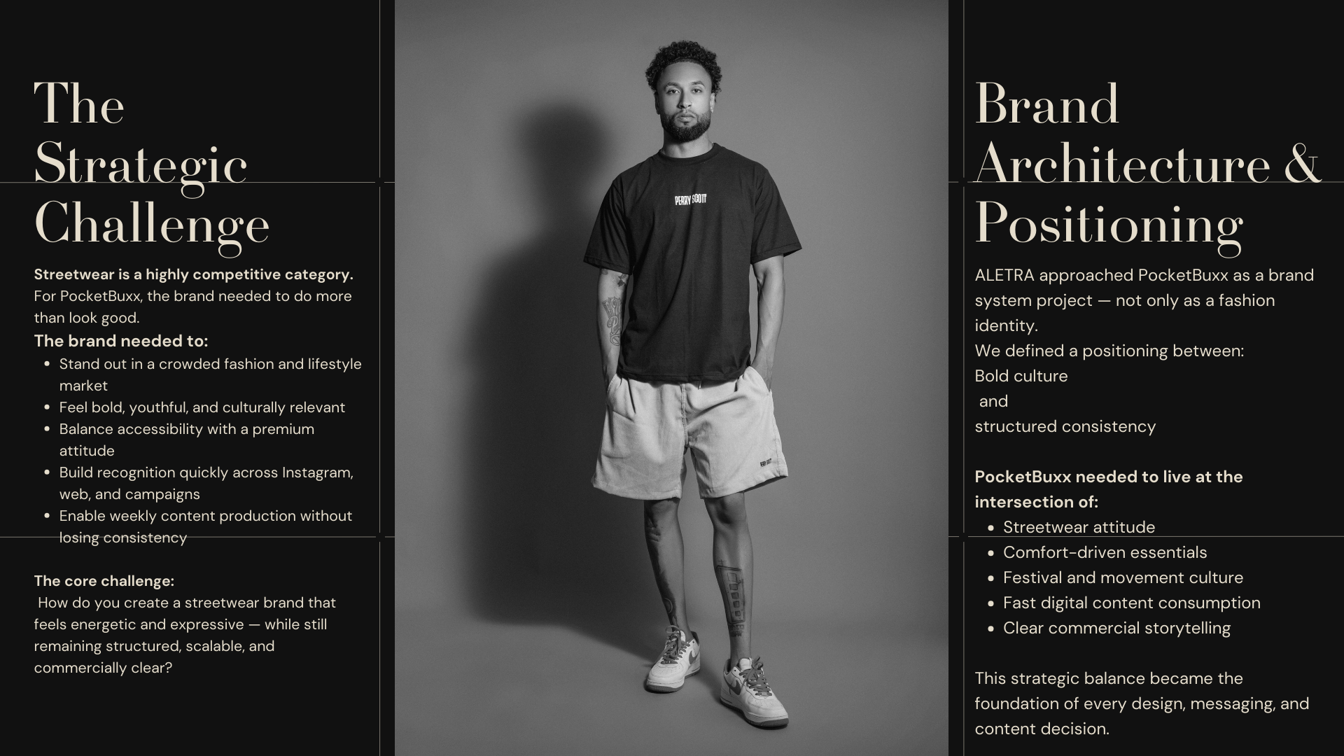
Challenge
PocketBuxx needed to stand out in a crowded apparel market with a look that feels youthful, premium, and immediately recognizable.
At the same time, the brand needed enough structure to produce content consistently across products, launches, and social media without losing clarity or quality.
Approach
ALETRA built the brand around three strategic priorities:
- Distinct brand recognition — bold visual cues, clear tone, and strong stylistic consistency
- Scalable content production — repeatable templates and structured formats for weekly output
- Conversion-first storytelling — product messaging focused on comfort, quality, and lifestyle relevance communicated quickly and clearly
Deliverables
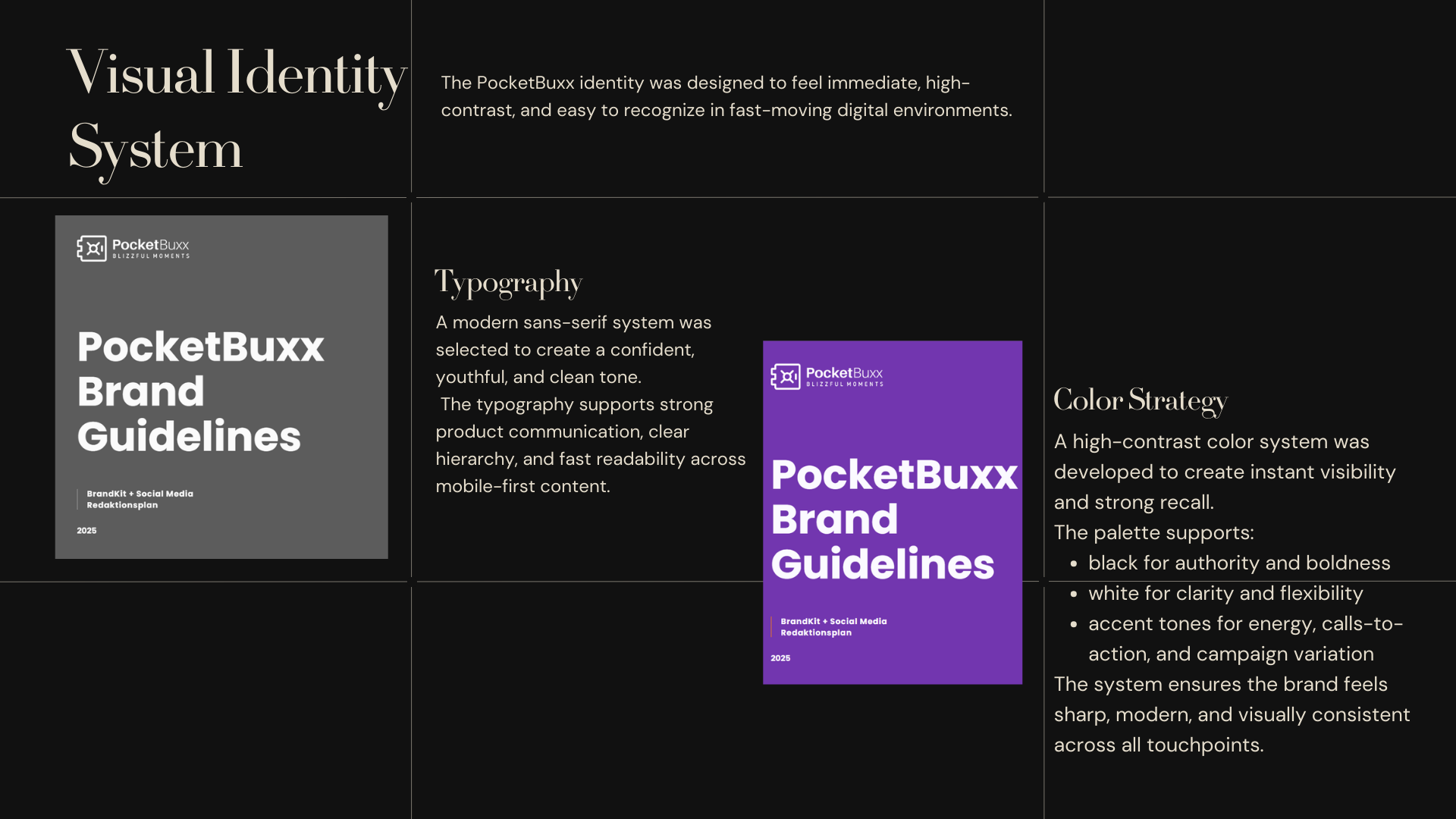
- Brand identity rules and visual system
- Typography, color, and layout guidance
- Social templates for promos, announcements, drops, and product highlights
- Creative direction for recurring post and reel formats
- Product storytelling structure for launches and campaign content
- Consistency guide for future campaigns and collaborations
Visual language
- Color — a high-contrast visual base with bold accents to create fast recognition and stronger calls to action
- Type — modern sans-serif typography with a confident, youthful tone
- Layout — punchy hierarchy, product-first composition, and bold spacing designed for digital attention
- Style — clear, energetic, and built for scroll-stopping communication across web and social
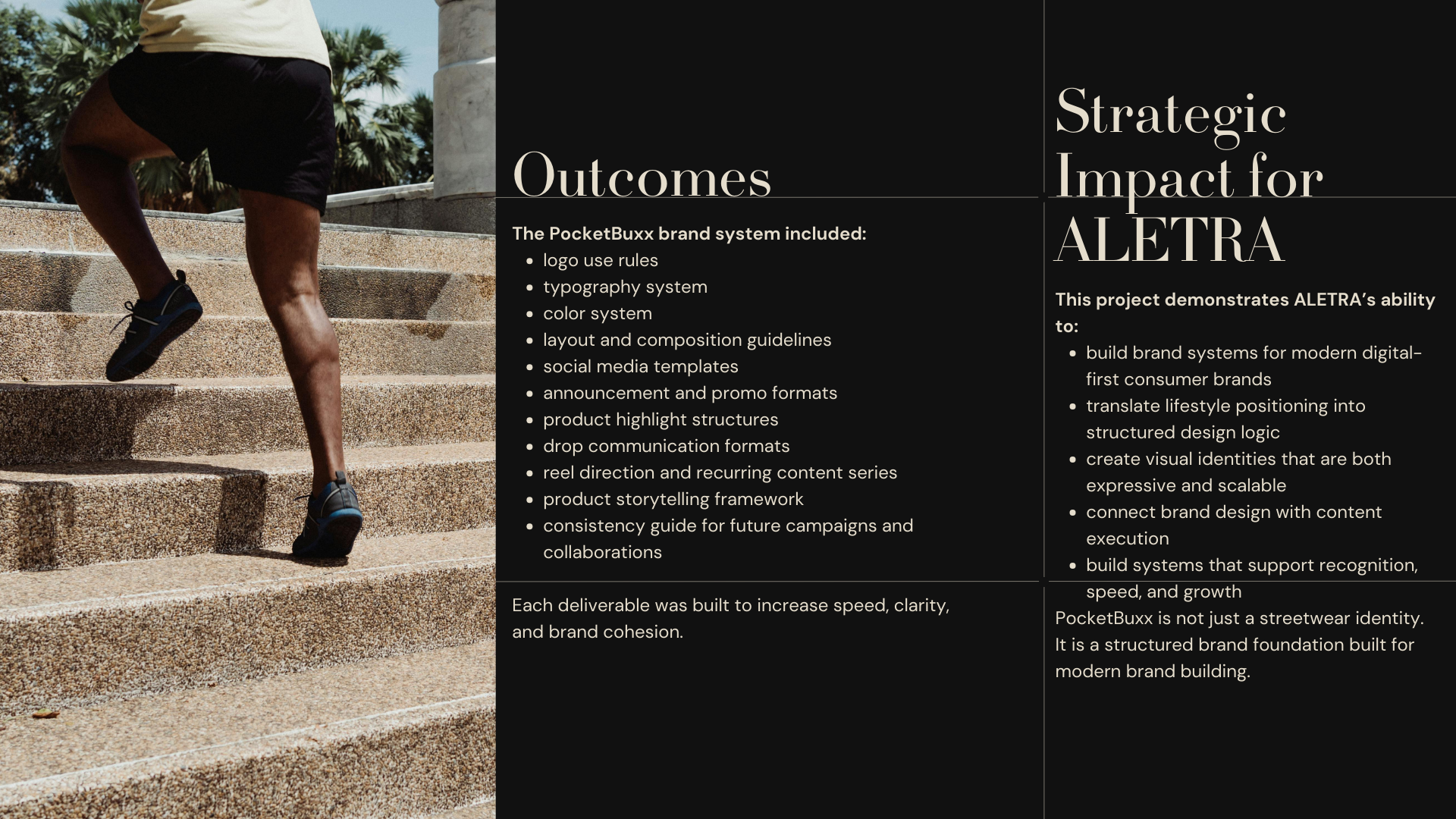
Outcome
PocketBuxx now has a stronger and more coherent brand presence built for consistency, visibility, and scale.
The project delivered:
- a clearer visual identity with stronger recognition across touchpoints
- repeatable content formats for weekly posting and product communication
- a more structured system for launches, drops, and collaborations
- a scalable brand foundation that connects design, storytelling, and growth

.png)